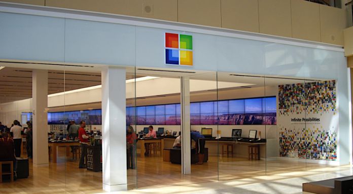
The change is reflected by a new logo for the app, switching to a simple perspective and adding a splash of color to the Windows icon. The decision is undoubtedly an attempt to unify the company’s various storefronts, matching its online portal. It’s not clear, however, what other modifications the change will bring. The switch to a less Windows-focused branding could signal Microsoft’s plans to introduce more than software purchases to its OS. Its online portal features hardware from a variety of partners, including HP, Dell, Alienware, Lenovo, and ASUS. There could also be offerings of its Surface, Xbox, and Azure products, depending on the install and the customer’s region.
Business and Education Shift
However, it could also mark the company’s transition to a wider audience, reflecting services available in the business and education markets. Currently, only those customers see the changes, and previous documentation reads: “Welcome to the Microsoft Store for Business and Education! You can use Microsoft Store to find, acquire, distribute, and manage apps for your organization or school. You can also work with developers to create line-of-business apps that are only available to your organization. IT admins can sign up for the Microsoft Store for Business and Education, and get started working with apps.” For now, though, the change is just in the name and logo. It isn’t unheard of for Microsoft to test different names regularly – it’s naming indecision for the Photos app is a prime example. Personally, I’m not sure how to feel. While I’m all for fixing the company’s mish-mash branding, I’m not sure I want unrelated products cluttering the interface.


