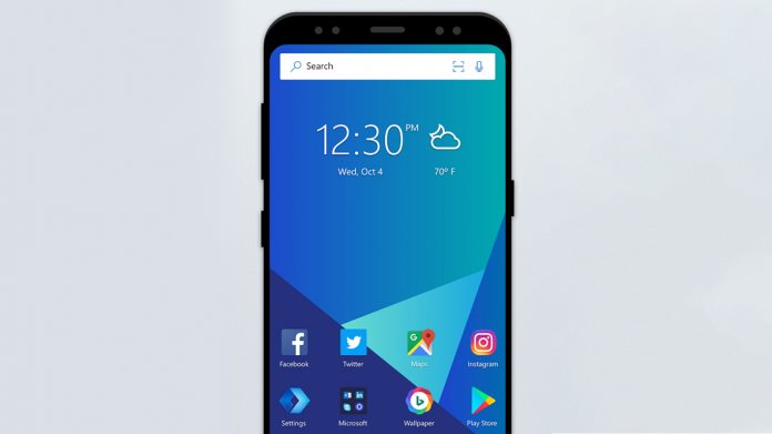
Currently in preview, the new launcher takes many of the great things about Arrow and improves them. You won’t see Windows-like tiles here, but it does run somewhat in tandem with your PC. Microsoft’s ‘Continue on PC’ functionality lets users switch near-seamlessly between phone and computer straight from the home screen. Selecting a recent file presents users with the option to launch it on their desktop with only a short delay. The feature is infinitely useful for those who often work on the go, letting you carry on where you left off. This also applies to photos, so you can take a picture and see it instantly on your desktop. To make use, you just have to be on the Windows 10 Fall Creators Update or higher. Of course, all of these files are also uploaded to OneDrive.
Beautiful Re-Design
As well as plenty of new features, Microsoft Launcher introduces a fresh new look, whilst still keeping elements of Arrow. While the app drawer and dock are largely unchanged, you can now theme your launcher, with a choice between transparent, dark, and white. You can also change the accent color, fitting in much better with Microsoft’s current design philosophies. I’m not sure all of it is better than Arrow Launcher, but there’s definitely an improvement in most regards. There’s also UX changes in the form of gestures, which let you set custom swipes to access menus. By default, you can swipe up to expand the dock, double tap to lock the screen, and pinch out to view your recent apps. Once you learn them all, browsing Android is much faster. Of course, it is a preview version, so there are also bugs. The homescreen sometimes retains the dark overlay of the app drawer, and scrolling vertically through widgets can cause lag. In all, though, it’s a step forward for the launcher and nothing that can’t be fixed with a few updates. You get it for yourself from the Google Play Store.


