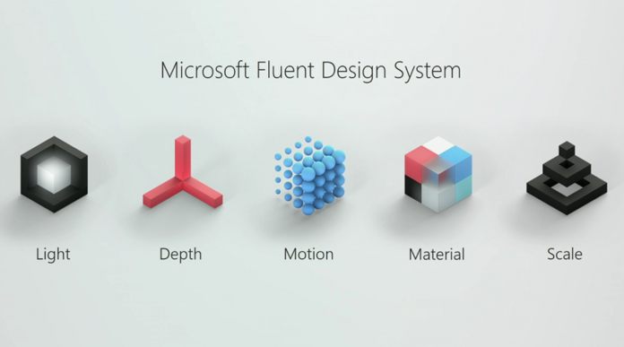
Now the initial hype is over, we have some more details about what exactly the Fluent Design System is, how it will start, and how it will grow. The first thing to understand is that Fluid is closely tied to AR and VR. As we switch from 2D to 3D, more efficient ways of doing interface arise. However, the technology isn’t mainstream yet, and people aren’t going to want a headset on their face 24/7.
It’s important, then, to have a design system that scales well across 2D, 3D, and various size screens. That’s where the Fluent Design System should really start to shine.
A Wave-based Update Model
Despite this, Microsoft has emphasized that the system is still in the early stages. It thinks of the interaction coming in Fall as ‘Wave 1’ – primarily just visual and animation tweaks. We’ve seen this in Microsoft’s demos already. Acrylic is the company’s mash-up of Windows Aero and the current UWP interface. It contains a lot of transparent, blurred, and subtly animating elements.
Wave 2 is a bit more drastic. The Redmond giant is planning 360 media playback, intelligently scaling headers, Z-Depth layering, spatial sound, and speech support. However, Microsoft is emphasizing that this is no set thing. Fluid will be more of a slow evolution, taking into account feedback and new technologies.


