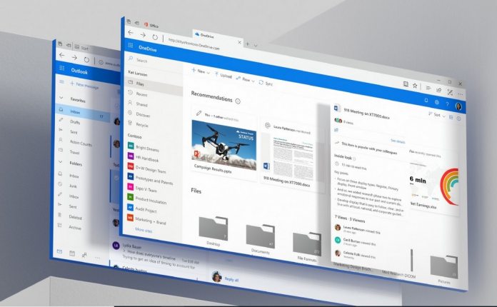
In fact, Fluent Design was debuted a full two years ago at Build 2017 and arrived on Windows 10 alongside Windows 10 Fall Creators Update. Microsoft said at the time, Fluent Design is a gradual evolving UI. “I think what we learned, at least on phone, is that to have a great design system, it cannot just be for one product,” says Albert Shum, head of design for Windows. “It’s how do you actually scale it out to hundreds of products serving millions of customers, in some ways, billions of customers?” The problem has been the new aesthetic has been a little to gradual for our taste. If anything, Windows 10 looks even more fragmented than it did before. Microsoft’s slow rollout of Fluent Design has caused some visual contradictions.
Most obvious of them is the fact some apps have been given the new UI and others haven’t. The result is some services looking modern and others looking old or unfinished. According to a report in The Verge, Microsoft is changing the philosophy of its open design concept.
Open and United
Windows designers and engineers wants to create a more uniform experience across the platform. The company says the new UI will also help modernize software on Windows 10, including faster app startup times.
Back in December, Microsoft explained how Fluent Design will become a universal concept across its services. We have seen the aesthetic influence on Office app icons, with Windows icons also in development. Microsoft Office UX chief John Friedman says the company now sees design as an “internal open source team” where divisions work in unison to create a uniform aesthetic. That won’t stop Fluent Design from evolving but will ensure services are in sync with design elements.


