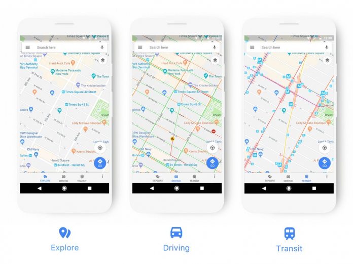
With the redesign, which mainly refers to the presentation of items, the company wants to increase clarity in the many different views of the application. The new design covers everything from exploration to navigation and transit mode. For example, petrol stations are highlighted more prominently in navigation mode, while bus, train and other public transport stops will be highlighted in transit mode. In order to make it easier for the user to distinguish between different establishments at a glance, Google introduces a new colour scheme: restaurants, cafés and other catering facilities are displayed in orange, cinemas, theatres and other places for entertainment are turquoise. In future, shopping malls will be colored blue in Google Maps. Here is the complete color scheme:
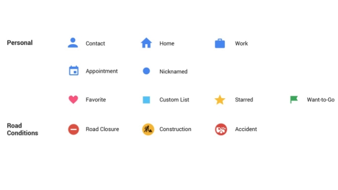
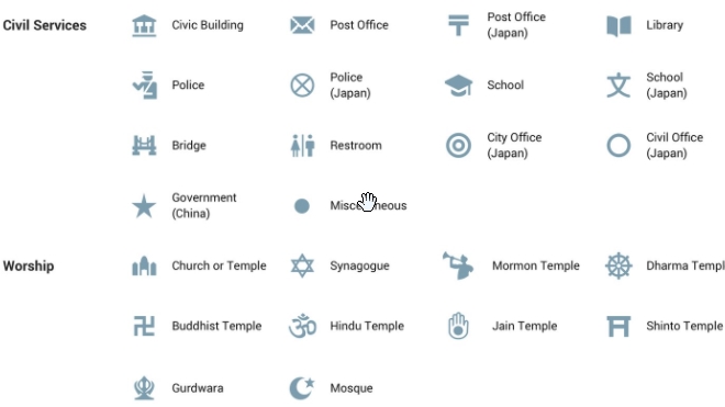
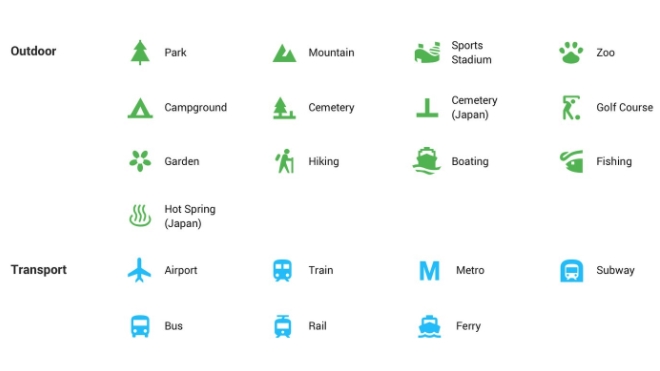
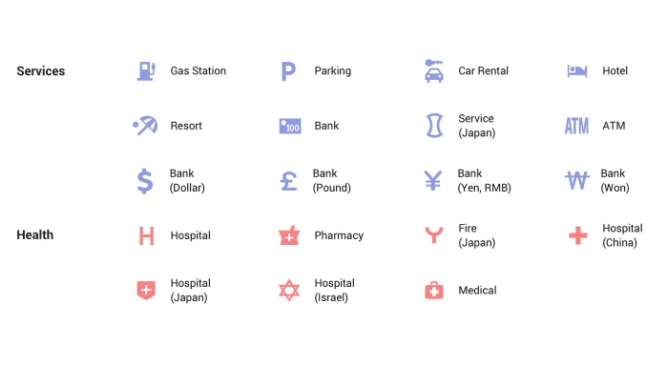
In addition, Google introduces countless new icons to distinguish the many different facilities. There will also be new symbols for road closures, construction work and car accidents. All new icons at a glance: All devices using Google Maps will receive the update within the next weeks. The changes will also be incorporated into the Google Assistant, Google search, Google Earth and Android Auto. In addition, the new features will also be available on sites that embed the Google Maps APIs.
